Tuesday, 1 October 2013

Why we need feminism


The picture above is the last panel of a comic about feminism I saw on tumblr. It is made by tumblr user kateordie and you can read the whole comic here. I think it's nice how many comics these days talk about important issues. By making it in comic form, the message can be presented interestingly and reach a wider audience.

I am a feminist and always proud of it. Sometimes, people ask why I am so concerned about feminism. I personally think we all should be feminist. Why? Firstly, because it is important and for a good cause. Feminism is not about women empowering men. It is about equality. Women don't want to rule men, we just want to be treated equally.

Secondly, because the sexism and misogyny towards women these days are very disgusting. Since we were young, little girls were taught to be quiet, obedient, and dainty. When boys hit us, our parents let them be because 'boys will be boys'. This continues until we grow up, where men get higher job positions and better pay. 

Recently, I was chatting with my ex-classmate from Indonesia (one of the very few open-minded Indonesian peers that I knew). He told me that an Indonesian governor in Sumatra proposed for virginity tests in high school entrance exams. 

I was dumbfounded. As far as I know, virginity and academic performance or intelligence is not connected in any way. However, the governor said that they will do this so the non-virgins will not blend and influence the virgins.

What.

My friend continued the story, and it just got worse. He said that only female students will have to go through this virginity test since there is no way to test the male students.

Even idiots can tell how unfair this is. I am also thinking about female students who are victims of rape. So they don't deserve a good education, but rapists do?

In conclusion, I wish people who think that women today are totally emancipated would open their eyes. We live in a world where women are still oppressed.  That's why we need feminism to get rid of the double standards.

Thursday, 26 September 2013

Eloy Morales


The first time I saw Eloy Morales' work,  thought of it as a series of HD photographs of people with paint on their faces. I thought they looked cool. Then, I saw this:


And I realized that those are not photographs. This guy painted large scale portraits of people with thickly painted faces on wide canvas with such meticulous detail that they look like digitally printed photographs.

Morales is a Madrid-based artist. He creates hyper-realistic portraits with oil paint as his medium. Many of his works are self portraits. However, his works are more than just recreating pictures. He believes that his painting is a form of individual expression, and his works try to show the psychological aspects of the subjects painted.

I am really amazed by his works. He must have a lot of patience to do all the layering on the canvas. I like the touch of paint on his portraits' faces. They make them look more photorealistic, while adding colors and the illusion of depth or texture at the same time. The peculiar expressions also stole my attention.


Silver Spoon


When someone who never read manga before asked me for a good title, I always suggested Silver Spoon by Arakawa Hiromu. Manga and Anime fans might know Arakawa from her from her previous work Fullmetal Alchemist (which used to be my favorite manga of all time). However, Silver Spoon is a completely different story than Fullmetal Alchemist. 

Falling to the slice of life, drama, and comedy genre, Silver Spoon is a story about a city boy named Hachiken who went to an agricultural high school called Yezo High located in Hokkaido. Growing up with a strict father of high expectations, Hachiken chose school with a dormitory to escape from his father when he failed the entrance test of a good school. He thought that an agricultural school will be easy for someone who studies as much as him, but life in Yezo high proved to have its own challenges for a Sapporo boy like him.

I enjoyed the manga very much. It is a salad of thoughtful moments and pure comedic genius. There are many issues discussed in this manga - with family relations, friendship, and finding one's true dream being the focus. There are many well developed characters that readers can connect. Some have inferiority complex, family issues, money problems, school problems, not being able to reach their dreams, etc. I find Hachiken's struggle with finding what he actually wants very interesting and believable. I think it is a dilemma many highschoolers face. The story also makes the readers realize the things they take for granted, and taught them to believe in second chances.

Other than that, the manga is a very good, stress relieving easy read. It is one of the funniest manga I have ever read (after The Law of Ueki) with hilarious characters. I enjoy the usually unexplored theme for a shounen manga. There are not many manga with an agricultural life as the setting. The distinct clean, beautiful style of Arakawa's pen strokes is also prominent, making the art visually pleasing to look at. In short, it is greatly recommended! 


Elementary and Sherlock

The new season of Elementary premieres in a few days, and I'm so excited. I just finished marathon-ing the first season and it is now my new favorite TV show. The show is a modern adaptation of Sir Arthur Conan Doyle's famous fictional detective, Sherlock Holmes, set in the US. There are some controversies regarding this series since BBC also has a TV show 'Sherlock' with the same concept. I personally love and enjoy both of them, and I don't understand how many of the fans loved one and hated the other. 

A view of the London skyline, with the word "Sherlock" in black letters

First, I think these two series are actually very different. Sherlock only has three episodes er season. Hence, each of them is very complicated and detailed. The plot development is nail biting with jaw-dropping twists. Elementary has 24 episodes in a season, and all but four are separate cases with no connections whatsoever between them. It is simpler, but makes up for it by not making their fans wait nearly two years for only three episodes. What bores you out of Elementary is actually the overused plot twists. After the first three episodes, you will realize that the first, second, an sometimes third suspect is in fact not the criminal.

For acting, I still think BBC's Sherlock is better. They also have wonderful casting - made of very good, renowned actors. I especially liked the three important characters; Sherlock, Watson, and Moriarty. For Elementary, my favorite is without doubt the Watson played by Lucy Liu. She is a very subtle actor and I love every scene with her in it..

PILOT

Generally, Sherlock has more fans and viewers than Elementary. It is also considered more successful. However, what hooks me to Elementary is its approach to equality and representation. Elementary took the liberty of changing the sex and gender of John Watson into a cis female. She is also a woman of color. Unlike BBC's Sherlock, which is made up of almost completely white, male characters, Elementary has a diverse (thus realistic) cast. There are Asians and African-Americans playing major roles (not background characters or props). The women on the show do not exist as plot devices for men, but are deep characters with interesting developments. The show also has a trans woman character who is played by a real trans woman.

In conclusion, Sherlock is better in terms of storyline and acting. Elementary is simpler and aces in its modern social representation. I think both of them are great in terms of set and costume design. The set of BBC Sherlock's apartment is very detailed and elaborate - as if you can see the character's personality from it. Elementary's Watson has a neat wardrobe - pretty, practical, and modern. 

Alice in Wonderland's Costumes


While Tim Burton's Alice in Wonderland (2010) is not my favorite movie, I still think that it had some of the most beautiful costume designs. Of course, Hollywood movies of fairy tale settings mostly have great costumes, but I like how there are so many details even in costumes with minute screen appearance. I think all the characters have beautiful, statement outfits, but I'd like to talk about Alice's costumes.

Costume designer Colleen Atwood purposely designed new concept dresses for Alice. She didn't want the cliche Alice-in-blue-dress-with-white-apron-and-white-headband look that got feral since the Disney version of the movie came out. She also insisted in not dressing Alice in hoopskirts or corsets, to represent the character's free personality and modern mindset.

The two pictures above are my two favorite Alice costumes. The one on the left is her dress when she grew bigger and had to wear make-shift clothes out of the curtains in the Red Queen's castle. I like the ruffles and the playful look of it. The one on the right is her battle armor - one of the very few women's battle-suits in movies that doesn't sexualize the body, is realistic/believable and still manage to look beautiful. I like the gorgeous details and the fact that the armor actually covers the body. Of course, there is nothing wrong with women who are comfortable in showing skin when they dress up (and vice versa), but I'm sick of seeing super sexy, probably-not-comfortable and surely-not-safe battle outfits for women just so men can see their breasts. The armor in this movie is a nice change indeed.

Inflatable Concert Hall


This is the world's first inflatable concert hall, located in the disaster hit northeastern coast of Matsushima, Miyagi prefecture, Japan. The giant purple structure is called Ark Nova, designed by British sculptor Anish Kapoor and Japanese architect Arata Isozaki. The balloon is coated with polyester material. It measure 18 meters high and 35 meters wide when fully inflated, holding up to 500 people. It can be easily deflated to travel around. The seats are made from fallen cedar trees.

While it may not be possible for grand, large scale concerts, I like the idea of this concert hall because it's very practical for small ones. I think with this innovation, holding charity events will be easier as the hall can be set up on any piece of empty land instead of renting a hall or building. I also like the design of it. It kind of looks like a giant jelly bean :)

Crime Against Nature

Crime Against Nature by Gwenn SeemelCrime Against Nature by Gwenn Seemel

Crime Against Nature is a beautifully illustrated children book by Gwenn Semeel, exploring the many different types of sex and gender roles, sexuality, family structure, etc in the animal kingdom. I am in love with the idea of this book. We often diss people who don't fall into the common tropes in society as being crimes against nature - abnormal, wrong, and not supposed to happen. The book shows that there is in fact a very diverse variety of these issues in nature. 

I think it is a great way to explain these kind of stuffs. While this book is intended for children, I think many adults need to read this book as well. 

Another thing that makes this book special is how it explains things the way they are. Sometimes, adults are reluctant to explain things like intercourse, sex change, homosexuality, etc to children and opt to give a lousy answer when they ask. This book is honest and doesn't use sugarcoated, shallow explanations to show that these things are not taboo at all, and it's good for children to be open-minded.

These are some of my favorites:

"Boys can become girls. When a clownfish female is removed from her anemone home, the male turns into a female and one of the couple’s young becomes a mature male. The new pair continues to breed in the same anemone."

"Some boys and girls don’t make babies at all. Gray wolves tend to live in packs with only the dominant male and the dominant female reproducing. Other members of the pack nurture the young along with the parents."

"Among black swans, males sometimes pair-bond with other males. These couples tend to be successful as parents since the combined strength of two males allows the swans to maintain a larger nesting territory. They acquire eggs to raise either by briefly forming a trio with a female or by taking over the nest of a heterosexual couple."

Harry Potter :)


So the Harry Potter fandom came back to life recently when J. K. Rowling announced that there will be a new series set in the Potter Verse. The films will be her screenwriting debut, and while it is not a prequel or a sequel to the Harry Potter series, she promised it to be special. The first film is called 'Fantastic Beasts and Where to Find Them', which is a book written by Newt Scamander in the HP series.

I am so hyped about this new film. I miss Harry Potter so much, and I have this nostalgic feeling when I see people starting to talk about Harry Potter again. When I was a kid, I liked to imagine how I will be if I am a wizard who went to Hogwarts. Here are some things that I remember deciding for myself:

My Hogwarts house: Ravenclaw (I'm a bit like Luna)
My pet: An owl, but I like the idea of a Munchkin Cat that I can cuddle with
My patronus: A house cat
My boggart: Tricky, because my biggest fear is heights. Probably a giant cockroach.
My amortentia: The smell of book pages, apples, and freshly washed sheets.
My favorite subject: Transfiguration, or Charms

I think I have a lot more, but I forgot. Anyway, I really hope the new series is going to turn out great. I hope it won't disappoint me like Pottermore .___.

Tuesday, 24 September 2013

Pixar Headquarters

pixar0 Pixar HQ

I just recently stumbled across a photo of how the inside of Pixar's headquarters look like. The office of this world famous animation company is located in Emeryville, California. Like many large companies, the campus is huge. However, what makes this place special is the unique interior of the offices. The people working at Pixars have their own cubicle, shaped like neat little houses. These small huts are decorated by the workers themselves, so there are many personal touches, like a basketball ring or stuffed toys.

Aside from that, the headquarters is also a great workplace in may other ways. There is a spacious garden, a cozy lounge, and a game room where you can play video games, ping pong, and other leisurely games. The walls are decorated by artworks from their movies. The characters from Pixar's movies also make appearance in the entrance hallway of the headquarters. Here, there many sculptures of Cars, The Incredibles, Finding Nemo, etc that adorn the area.

Sunday, 22 September 2013

Radler Trail Camp


The Radler Trail Camp are a series of outdoor shoes by Timberland. Made for campers and backpackers, the shoes are designed to look not only stylish, but also convenient and pack-able. The main point that stands out of this shoe design is the presence of a zipper that allows you to fold the shoe in half and zip it up. The zipped up shoe is extremely portable, even small enough to fit in a jacket pocket. There is also  a small loop on the back of each shoe to attach to a carabiner so it can be hung on the outside of a backpack.

Usually, when people go camping, they will bring sandals as they are lighter and take up less space than normal shoes. However, sandals are flimsy and slippery, not to mention less suitable in certain weather conditions. The Radler Trail Camp provides a solution for this problem. They are compact, lightweight, provide tight fit and traction, and can be worn comfortably during rainy season.

Saturday, 21 September 2013

Hanger Tea


The Hanger Tea is a packaging design for tea bags by Soon Mo Kang. It cleverly uses a pun between the word ‘tea’ and ‘tee’ (from t-shirt) as an inspiration for this cute idea. The box is turned into a mini cupboard where shirt-shaped teabags containing tea leafs are hung by a paper hanger. It looks really neat. Instead of the normal tea bags with a thread attached, this concept uses the paper hanger to hook around your cup’s rim. In this way, the tea-shirts can be pulled or removed without soaking your fingers.

I adore this design very much. It looks simple but attractive. Other than the concept, I also like the soft palette of colors chosen for this product.


Thursday, 19 September 2013

Silence Hurts


This is a poster that sends a powerful message. Its purpose is to raise public awareness on the victims of domestic abuse. More than often, people experiencing abuse in their homes are too scared to ask for help. This poster shows that just because they are not calling out for help, doesn't mean that they don’t need it.

The poster’s idea is very creative. At first glance, it looks just like a normal picture of a woman with a finger on her lips, as if making a ‘be quiet’ or ‘hush’ gesture. However, on closer look, you will realize that the hand is not actually hers, but a hand belonging to a man (her abuser). The scenario turns into one where the woman is forced to be silent by the abuser. This symbolizes that the signs of domestic abuse are usually not very obvious, and that these victims need our help to save them.

Flying Alarm Clock


I think that the Flying Alarm Clock is one of the most brilliant alarm clock designs to date. There are many unique alarm clocks these days, ones that can run away, ones that pour water on you, etc. However, I think the idea of this alarm clock is most successful in forcing someone to immediately open their eyes as soon as they hear the alarm ring. Why? Because they must see where the key flies off to!

The main concept of this design is a propeller that flies off from the clock itself. The propeller is the key that must be attached back to the clock in order to stop the blaring sound of the alarm.  I like the idea of this clock, because not only it forces someone to open their eyes and be aware, said person must also get up in order to retrieve the propeller. I think this clock can successfully wake people up.

Bounce Chair


The Bounce Chair is an innovative piece of furniture that promotes health and comfortableness. It is still in development, but I think a lot of people will be interested in this product once it comes out on the market. It functions like a Pilates ball, where it will keep the person’s body in constant movement according to what direction they lean on. The handle of the chair is not for leaning on, but serves as a structure to force your body to align with the vertical axes of the chair. The chair is also made from sustainable materials.

I like the idea of a chair that is good for the health of the users. The design also looks cool and professional. While it is not possible to put a Pilates ball in your office, the chair will without doubt fit in perfectly and even spice up the room with it’s modern, ergonomic design.

Wednesday, 18 September 2013

Festina Watches

 Festina water-filled packaging

The waterproof Festina watches' packaging is one of my favorite packaging idea. It is bold, creative, and eye catching. The idea is thought by Scholz & Friends, and I applaud them for this. I think a watch packaging that features a plastic bag filled with distilled water is unheard of before. 

The idea is very effective. Other than making the product stands out among others in the shelves, it shows the company's confidence in the product itself. Many watch manufacturers easily claim that their watches are waterproof, but not many has the confidence to sell it submerged in water at the very start. 

I also find the design very cool in terms of aesthetics. It is not easy to make a plastic bag full of water look elegant, but Festina's packaging works. I like how they suspend the watches in water, it gives a whimsical, dreamy feel to the product.

Boxetti Bed


Have you ever heard of a bedroom in a box? Well, this design from Boxetti may surprise you. Designed by Latvian-based artist Rolands Landsberg, it features a box unit that opens up to shos a double bed, a wardrobe, and a nightstand. It is also equipped with a spotlight and lighting above the headboard.

I think this is a very cool design in terms of both form and function. The idea of a box base is neat and tidy. The design is fresh, clean, and simple. All in all, it pleases the eyes of viewers. In terms of function, it saves a lot of space. For example, during the day, you can 'fold' your bedroom into a box and use the room for exercising. You can 'unfold' it at night when you want to sleep. I think it's a nice innovation for people living in apartments with limited space, or simply just for neat-freaks who want a tidy room.

Cradle Chair


The cradle chair designed by Richard Clarkson is my dream chair. It looks very cozy and comfortable. I would love to have one so I can spend the day napping, reading, and watching movies while rocking on it. It looks sturdy so I don't think I have to worry about toppling over backwards. I also like the choice of material. The natural look of the wood gives it a calm, serene feeling, and it works with the cream/white of the mattress. Aside from being comfortable, I like the aesthetics of this chair too. I think it will look good in a room.

The cradle chair is developed in collaboration with Grace Emmanual, Brodie Campbell, Jeremy Broker, Eamon Moore, Kahlivia Russell and Joya Boerrigter. The concept of this chair is taken from the idea of adults having a child-side within. I am sure the team is successful, children and adults alike must have loved to rock and sleep on this chair.

Monster Hands

Flyer design

I found this creative poster in the internet very interesting. It is actually a poster promoting hygiene by using soap and water to wash your hands, stopping the spreading of bacteria. The image of the poster is a play on the slogan 'Your hands can be dangerous'. In the picture, a pair of hands is positioned and painted on so it looks like a cartoon bacteria. The bacteria us given monster-like qualities, like big, angry eyes, sharp teeth, and pincers to make it look mean and dangerous.

I like this poster because it is very effective. The message is clear and the image can be understood easily. Humor is created by the play on words and the funny expression of the monster hand. I also like how the bright red color of the hand contrasts against the muted blue of the background. It makes the poster stand out.

Monday, 16 September 2013

Bio-Diversity


Bio-Diversity is an artwork featured on one of  New York Times' columns, 'Abstract City'. It comprises of leaves with interesting silhouettes. Some of them are naturally occurring while others are deliberately cut-out by the artist. Many of them provide humor by cutting the leaves to form shapes inspired by silly puns or jokes.

The artist, Christoph Neimann, likes to make art inspired by his daily life in New York City. I like how he can creatively turn autumn leaves that usually clutter the streets into these funny shapes.

I find these cut out leaves very interesting. They look simple but neat. The contrast between the natural material juxtapose with the silhouette of the objects, like the nut and the bolt or the wifi logo. I also think that the leaves' texture, pattern, and color gives the overall look a nice touch.


Tom Eckert's Sculptures


Tom Eckert's sculptures always blew my mind into indistinguishable bits. He makes amazing works of art, and the picture above is just one of my favorites. At first glance, most people would think that the sculpture is made from paper cards and fabric. Wrong. The material is none other than wood.

Yes, all of his artworks are made of traditionally carved wood that are painted over. The woods are so finely crafted and painted that it gives this hyper-realistic look. The 'cloth' looks silky, soft, and smooth. The transparency and weight looks real, and you can see how gravity works in the draping 'fabric'.

I also like how the artist uses unique composition in his artworks. Many of his sculptures features floating objects, like cards or books, giving them a magical look. 

Monday, 9 September 2013

Alessandro Diddi


Alessandro Diddi creates these mind-blowing illustrations with only pencils. His works look as if they are coming out of the flat paper if viewed from the right angle. By making use of shading and angle, he successfully makes his 2D drawings look like realistic 3D objects, tricking the viewers.


3D drawings by alessandro diddi

I still find it hard to believe that these pictures are drawn on flat paper. The artist must have a very good understanding of perspective and shadows to be able to draw like that. It must be very difficult to draw the object with a specific distortion. I like how the 3D effect makes the picture unique and eye catching, even though the objects are rather simple, like doors and bridges.


How to make bad stuffs in life awesome

I was on tumblr when this post popped up in my dashboard. Apparently, this person (Laura De Fazio) has a younger brother who broke a bone and has to wear a cast. The cast will have to stay for a week, so they decided to make it more 'stylish'. In their case, 'stylish' means Iron Man.


I love what they did with the cast. Casts are usually just a boring white, with the exception of some bright colored casts provided by the children's ward in some hospitals. Other than that, we usually decorate a cast by having people sign of write 'get well soon's on them. I never think of drawing things like robot arms or armor plates on them. I think painting Iron Man arm on a cast is a good way to cheer someone up. They can get that extra funky look :)

Sunday, 8 September 2013

Fruit Juice Packaging


These fruit juice packaging are the creation of Japanese industrial designer Naoto Fukasawa. Each juice box has the skin texture of the fruit flavor they contain. They look and feel realistic, and it's obvious enough to tell what the juice inside the box is. For example, even though nothing is written on the box, you can easily tell that the first box is strawberry juice, the second is banana, and the third is kiwi. 

I think they are unique and appealing to the eye. They must also be effective in terms of marketing, as I am sure these juice boxes are more eye catching that the typical ones we usually see.

I really like the idea of this packaging. I admire the designer for his creative mind and his skill in recreating realistic fruit skin textures on the boxes.

Cuddle Jacket

t jacket

On the outside, it looks like a normal jacket with a hoodie. However, the Cuddle Jacket developed in Singapore can give the wearer a sensation of being hugged. It does so by using air bubbles that can be inflated inwards to give pressure.

It is connected to an application in a phone that can control the type and strength of the hug, for example, a pat on the shoulders or a tight squeeze.

This innovative jacket is especially useful for people suffering from disorders, like children with autism. Autistic kids can get stressed or agitated easily by their environment. The Cuddle Jacket can help calm them down since the hugs have a soothing effect. The jacket can even monitor vital signs and alert the parents if things are going awry.

I think it is a great invention. I believe it can help many people with anxiety or panic attacts. I really hope they can make this thing cheaper, though. Right now, it's still at $499 :'(

Friday, 6 September 2013

Ran Hwang's Art


Ran Hwang is a Korean-born artist who creates unique installations. Her works are huge, taking up a lot of space in the wall. The amazing thing about her is how she makes use of pins and buttons to create her massive installations.

Her work obviously took a lot of time and effort as she has to hammer all the pins to the wall one by one. The pins are so close together that they form an image, and the number of pins used is shocking when the artwork is inspected closely. Hwang said that her work is like a meditation for her. She chose buttons as her medium as buttons are ordinary,like the existence of human beings. The pins are used to hold the buttons, but there are no adhesive used. The buttons are free to move, which she used as a representation of the human tendency to be irresolute.

Paper Hamburger


A cut paper hamburger by Zim and Zou

This is a hamburger made out of cut-out colored papers by Zim and Zou. They made this for the cover of an Icon magazine issue entitled  'Future of Food'. It is inspired by the hype of inventing a printer that can print out edible foods, which hopefully can come true in the near future.

I am fascinated by this work because of it's details and meticulous neatness. A lot of attention is paid to every part of the paper burger, like the holes in the cheese, the cross section of the sliced cucumbers, the dripping tomato sauce, etc. I also like the bright, vibrant colors. It makes the burger pop out and look very eye catching.

The artists have more interesting artworks made of art in their portfolio here.


Thursday, 5 September 2013

Fore-Edge Book Paintings

Secret Fore Edge Paintings Revealed in Early 19th Century Books at the University of Iowa seasons painting illustration fore edge painting books

Fore-edge painting is the term used for pictures that are painted on the edge of a book's pages. However, the picture will not be visible unless someone fan out the pages of the book. It is a clever way of hiding the image. Even better, some books have double fore-edge paintings. This means, if you fan out the pages in the opposite direction (from the back cover to the cover), a different image will be formed.

The earliest fore-edge paintings date back as early as the 1650s. The pictures shown here are the book collections from the University of Iowa. They are made by Robert Mudie in the early 19th century. There are four books named after the seasons: Spring, Summer, Autumn, and Winter. I am very amazed since not only are all the pictures beautiful, the four books have double fore-edge paintings! I'm sure a lot of creativity, time, patience and skill must be put n each of these books. My personal favorite is Autumn, which is the first picture above.

Winter:
Secret Fore Edge Paintings Revealed in Early 19th Century Books at the University of Iowa seasons painting illustration fore edge painting books  Secret Fore Edge Paintings Revealed in Early 19th Century Books at the University of Iowa seasons painting illustration fore edge painting books

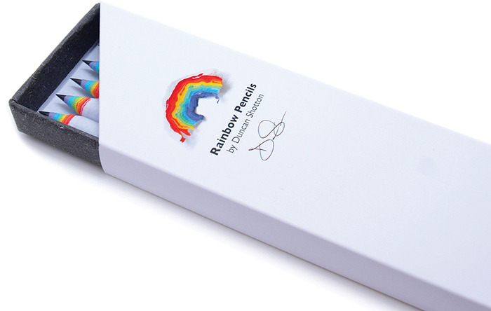
Rainbow Pencils


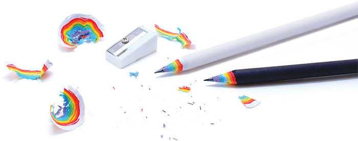
Rainbow Pencils is a cute product by Duncan Shotton. The pencils work just like your typical wooden pencils, with the same length and weight. They come in two colors - black and white. The unique thing about these rainbow pencils is that when you sharpen them, the sharpener residue will look like a rainbow. No special sharpener is needed to make this. 


I think it is a very creative idea to make everyday 'boring' objects like a pencil to be something more fun that can make people happy. I also like how the product promotes Go Green. It reduces the number of trees being cut down for wood and reduces the amount of paper in landfills since unlike most, these Rainbow Pencils are made from recycled paper. Cool!


Wednesday, 4 September 2013

Air Umbrella

air_umbrella

This is a very cool design by Je Sung Park and Woo Jung Kwon. Instead of the normal umbrella made of wire and fabric/plastic, the air umbrella blew air steadily to form a barrier, shielding you from raindrops.

It is innovative and convenient. Unlike traditionally shaped umbrella, it will not flip upside down when there is strong wind. The size of the canopy can be adjusted depending on the number of people standing under it. 

It is also easy to use in terms of portability. The hollow stick has an adjustable length and can fit inside any bag. Furthermore, since it will not get wet, the use of plastic bags for holding soaked umbrellas can be reduced. I especially love this aspect of the umbrella since usually I'm very lazy to carry a wet umbrella around, and would just rather run under the rain. With the air umbrella, I don't need to do this anymore!

The thing that I'm worried about is whether the eco-friendliness of reducing umbrella plastic bags makes up for the pollution caused by making the umbrella itself and the electricity used for the battery ._______.

Wednesday, 28 August 2013

Book Covers

One of my greatest dilemmas is when a book has several good versions of the cover.  I am very particular about book covers. I am one of those people who will never buy the movie version book cover. They always look silly and rather childish.

I like simple covers, especially if they can show something that symbolizes the essence of the book. I like these books because when you reach that particular part (or finish the book), you get this satisfaction for finally getting the cover. I also like old/retro/vintage looking covers, like Mitch Albom’s books.


I usually don’t like heavily illustrated covers, like the Harry Potter series (this is hard to write because Harry Potter is my absolute favorite when I am younger, and I still like it). Strangely, I loathe the adult version of the covers even more; they don’t leave any impression at all!

 File:HP1 adult.jpg

My mother likes to complain that I spend ages in the bookstore choosing which version of the same book to buy. She always say ‘Don’t judge a book by its cover’. Well, I say, ‘Judge away’. The author probably realize that no one will buy a book with the title written in Comic Sans and a sucky layout, so I’m pretty sure they put some thought into the covers too. I believe that it’s okay to judge books by their covers, just don’t judge people by how they look like from the outside.

Monday, 19 August 2013

Love Simply Is - The Witch of Portobello

“The day is made up of 24 hours and an infinite number of moments. We need to be aware of those moments and make the most of them regardless of whether we're busy doing something or contemplating life.”
File:The Witch of Portobello.jpg

Reading has been my hobby since I was a child. However, since school life is always hectic, I don't read as much as I'd like to, and can only do so during school holidays. This is why I am absolutely delighted when my language arts lecturer requires us to read a lot. I immediately started reading Paulo Coelho's The Witch of Portobello, which has been on my reading list for a long time.

I finished the book today, and I must say I greatly enjoyed it. The book is a story about a woman called Athena and her journey to find what she wants in life. In this journey she found her true self and got in touch with ‘The Mother’, a deity present in everything.

The book explores a lot about love, happiness, and spirituality. It talks about beliefs similar to paganism or the religion of the gypsies, and may be quite controversial in some parts (this issue is also discussed in the book). However, I find myself very much agreeing with how the author wrote major religious groups like Catholicism and Christianity. It is true that many religions today lost its meaning and fail to do good deeds because of their hypocrisy, bigotry, and ignorance.

Overall, the book is very well written. It is deep and thought provoking. Even though I am a bit confused by the changing point-of-views at first, I quickly realized why the author decided to tell the story from many people’s perspectives. It makes the character seem more ‘real’ and layered, and helps us see things in different ways at once, instead of sticking to one definite story. ‘Be different’ is, in fact, one of the things the book taught its readers.

However, rather than a narrative story, the book sounds like a lecture or an introduction to paganism at some parts, so I don't recommend this to people who thirst for adventures and dynamic plots.
"The truth is that with each step we take, we arrive."

Tuesday, 13 August 2013

Anime

Anime is my childhood. I think I watched the first Digimon series when I was only 6 years old. When I was in primary school, I spent my evenings watching animes that were aired in the TV with my friends. I also had some DVDs of my favorite series. I mostly watched shounen (targeted towards boys) animes, like Beyblade or Yu Yu Hakusho. They usually have more interesting plots than the ones targeted for girls. Or maybe I am influenced by my neighbors who I watched these shows with since they are both boys.

When I look back, those shows I used to enjoy seem extremely silly now. They are more than often ridiculous and filled with nonsense. I also remember the art being very very bad, with disproportionate body, misaligned eyes, and rough animation.

However, anime has come a long way. I don’t watch them anymore, but I saw the enormous development. Studio Ghibli, for instance, have animes with beautifully drawn background. The scenery in Howl’s Moving Castle is especially gorgeous.  


There are also some hidden gems in new and less popular animes. My favorite example is Kotonoha no Niwa (Garden of Words) by Makoto Shinkai. The animation is very smooth, every scene is detailed and the art is lovely.


"A faint clap of thunder. Clouded skies, perhaps rain will come. If so, will stay here with me?
A faint clap of thunder. Even if rain comes or not. I will stay here, together with you."